
Introduction
Below is a case study from the Google Data Analytics Professional Certificate on Coursera.
Welcome to the Cyclistic bike-share analysis case study! In this case study, I work for a fictional company, Cyclistic, as a junior data analyst working on a marketing analyst team.
The director of marketing believes the company’s future success depends on maximizing the number of annual memberships. Therefore, my team wants to understand how casual riders and annual members use Cyclistic bikes differently.
In order to find the answer on the difference between the two types of riders, I followed the six steps of the data analysis process:
1. Ask:
· Define the problem: Clearly articulate the business problem or question you want to answer.
· Identify the goal: Determine what you want to achieve with the analysis.
· Set objectives: Define specific, measurable, achievable, relevant, and time-bound (SMART) objectives.
2. Prepare:
· Data collection: Gather the necessary data from various sources (e.g., databases, spreadsheets, APIs).
· Data cleaning: Clean and preprocess the data to remove errors, inconsistencies, and missing values.
· Data integration: Combine data from different sources into a unified dataset.
3. Process:
· Data exploration: Explore the data to understand its structure, distribution, and potential relationships.
· Data transformation: Transform the data into a suitable format for analysis, such as normalization, standardization, or feature engineering.
4. Analyze:
· Statistical analysis: Use statistical techniques to analyze the data and identify patterns, trends, and correlations.
· Data modeling: Build models to predict future outcomes or classify data into different categories.
· Hypothesis testing: Test hypotheses to determine the significance of findings.
5. Share:
· Data visualization: Create visualizations (charts, graphs, dashboards) to communicate insights effectively.
· Storytelling: Present findings in a clear and concise manner, using storytelling techniques to engage the audience.
· Reporting: Create reports to document the analysis process and findings.
6. Act:
· Decision-making: Use the insights gained from the analysis to make informed decisions.
· Implement solutions: Take action to address the problem or achieve the goal.
· Monitor and iterate: Continuously monitor the impact of the decisions and make adjustments as needed.
Ask
Three questions will guide the future marketing program:
1. How do annual members and casual riders use Cyclistic
bikes differently?
2. Why would casual riders buy Cyclistic annual memberships?
3. How can Cyclistic use digital media to influence casual riders to become members?
I’ve been assigned the first question:
1, How do annual members and casual riders use Cyclistic bikes differently?
Prepare
I’m using Cyclists’ historical trip data from here.
Note: Since I’m using Google Sheets, I’m restricted in usage space for my analysis.
Therefore, I’ll use the Divvy 2019 Q1 and Divvy 2020 Q1 datasets instead of a full-year dataset.
As a disclaimer, the data has been made available by Motivate International Inc. from here.
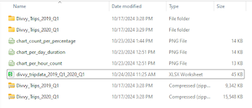
I’ve have the original csv’s located in the folder “Divvy_Trips_Case_Study”.
Process
I’ve imported the csv datasets into Google Sheets located in my Google Drive. Since I need to look into the bike use difference between ‘member’ riders and ‘casual’ riders, I’m going to use some and not all the data types.
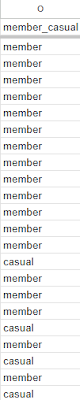
I’ve changed column titles from ‘usertype’ to ‘member_casual’ and rows from ‘subscriber’ and ‘customer’ to ‘member’ and ‘casual’ to make the columns and rows uniform.
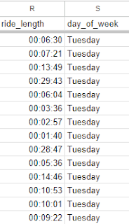
I’ll be working with columns ‘start_time’, ‘end_time’, ‘member_casual’ and adding new columns ‘ride_length’ and ‘day_of_week’ columns to the datasets.
I calculated the length of each ride by subtracting the column ‘start_time” from the column ‘end_time’ using the =D2-C2 function. This enabled me to get the results of the first row and by dragging the calculation down the ‘ride_length’ column get all the rows results . I got two results to show the duration in time of each bike ride and the time and day of the week of each bike ride.
In my ‘day_of_week’ column I use the =Switch(Weekday(C2), 1, “Sunday”, 2, “Monday”, etc. ) ) calculation to get the exact day of each unique bike ride. And like the ‘ride_length’ column, I simply dragged the calculation down the ‘day_of_week’ column to get all the rows.
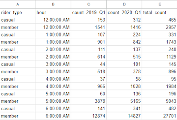
I used the =QUERY(FILTER(HOUR(A:A), B:B) function to separate the count of rides for ‘casual’ and ‘member’ riders per hour and put the results into ‘Hour’, ‘Rider Type’, and ‘Count’ columns.
I created two pivot tables to calculate and visualize (charts) the data.
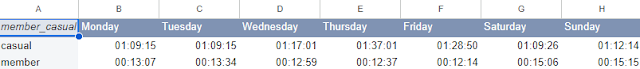
To get the total number (sum) of the ‘casual’ and ‘member’ riders for each day of the week, I used to the pivot table editor and put the ‘member_casual’ column into rows therefore separating the two type of bike riders; ‘casual’ and ‘member’. Next, I put the ‘day_of_week’ column into seven columns that represented the seven day of the week. Finally, I put ‘ride_length’ into the Values section as SUM to retrieve the total number of rides for each day for ‘casual’ and ‘member’ riders.
To get total number of rides for ‘member’ and ‘casual’ riders for each hour in the day (12:00 AM, 1:00 AM, 2:00 AM, etc.) in the pivot table editor under Rows I put the ‘Rider Type’ riders in separate rows for ‘casual’ and ‘member’ riders . Under Columns I added the ‘Hour’ column to create 24 columns for the 24 hours of the day. and in Values I added the ‘Count’ column and used the Average function.

The two data two sets were merged into one data-frame called divvy_tripdata_2019_Q1_2020_Q1.
Share
I created three charts using Google Sheets:
chart_count_per_percentage
chart_per_hour_count
chart_per_day_duration
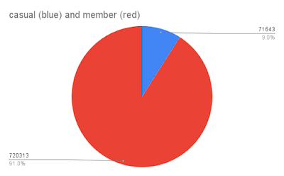
The chart_count_per_percentage shows the total number of riders (791956) between ‘member’ (720313) and ‘casual’ (71643), and in percentages ‘member’ (91%) and ‘casual’ (9%).
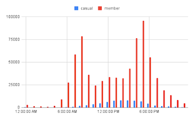
The chart_per_hour_count shows the total number of rides per hour of the day for ‘member’ and ‘casual’ riders.
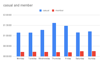
The chart_per_day_duration shows average ride duration per day for ‘member’ and ‘casual’ riders.
Key Observations from the three charts:
Peak Usage: Both casual and member riders exhibit peak usage between 5 PM and 7 PM, suggesting that a significant portion of rides are for commuting or leisure activities during these hours.
Member Usage: Member riders have a more consistent usage pattern throughout the day, with a slight increase in usage during the morning hours. This indicates that members might use the bikes for commuting or regular exercise.
Casual Usage: Casual riders have a more sporadic usage pattern, with higher peaks during the afternoon and evening hours. This suggests that casual riders might use the bikes for leisure activities or occasional trips.
Weekend Usage: Both groups show increased usage on weekends, especially during the afternoon and evening hours. This indicates that weekends are popular for leisure rides.
Act
Proposed Statement of Business Task:
To identify and analyze the distinct usage patterns and preferences of casual and member bike riders, in order to optimize the bike-sharing program’s marketing strategies and membership offerings.
Based on the data and insights you’ve shared, here are some recommendations for converting casual riders into members:
1. Offer Targeted Incentives:
· Membership Discounts: Provide discounts on membership fees or ride credits to attract casual riders.
· Exclusive Benefits: Offer exclusive perks to members, such as priority access to bikes, early access to new features, or discounts on merchandise.
2. Improve User Experience:
· Enhance App Features: Make the app more user-friendly and intuitive for casual riders, with features like navigation, route planning, and real-time bike availability.
· Expand Bike Network: Increase the availability of bikes and stations in areas with high casual rider usage to improve convenience and accessibility.
3. Promote Membership Benefits:
· Targeted Marketing: Create targeted marketing campaigns highlighting the benefits of membership to casual riders.
· Testimonials: Share success stories from existing members to showcase the value of membership.
4. Leverage Data Insights:
· Identify Peak Usage Times: Offer promotions or incentives during peak usage times for casual riders to encourage them to become members.
· Analyze Demographics: Target specific demographics that are more likely to convert to membership based on your data analysis.
If you have read this throughout thank you.

Leave a comment